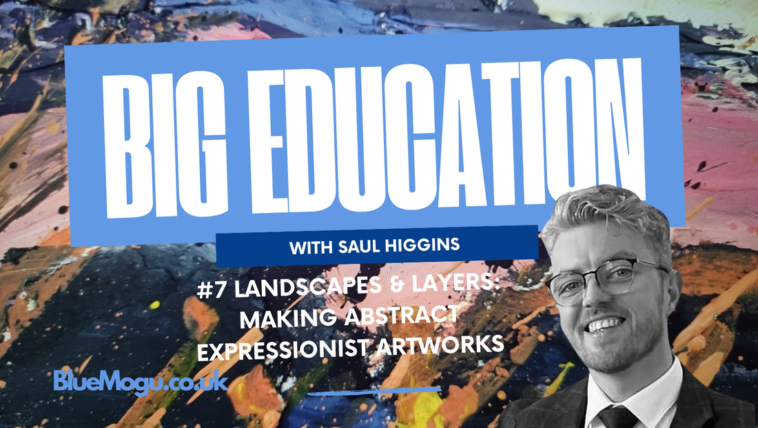
 Some of the most meditative (and messy) pieces I’ve worked on recently have started with simple landscape photos. These are usually my own (primary research) photographs that I’ve taken while travelling through places like the Scottish Highlands, the Peak District, and around the lakes and ridges of Malham Cove, Kinder Scout, and the Old Man of Coniston to name a few. I enjoy those places and the outdoors, which is probably the root of where that feeling originates and then translates to the artwork.
These are the kinds of places that leave a mark on your memory. The light and shadows of the rocky crevices, the jagged peaks, the way mist hangs over the valley, and some unique views that you can only achieve early in the morning or at the change of seasons. it’s all stored somewhere in your mind. And sometimes, it comes out through paint and process.
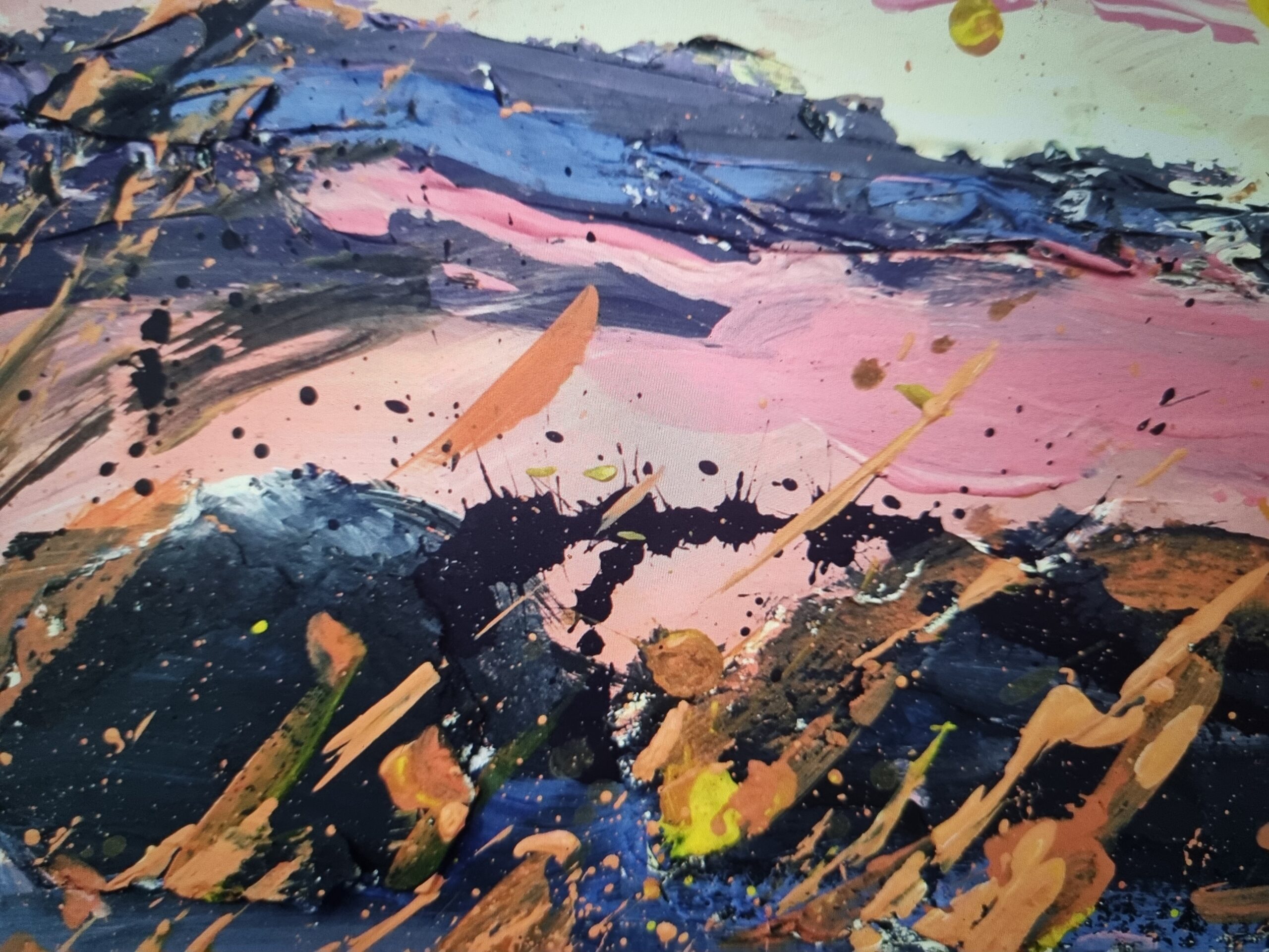
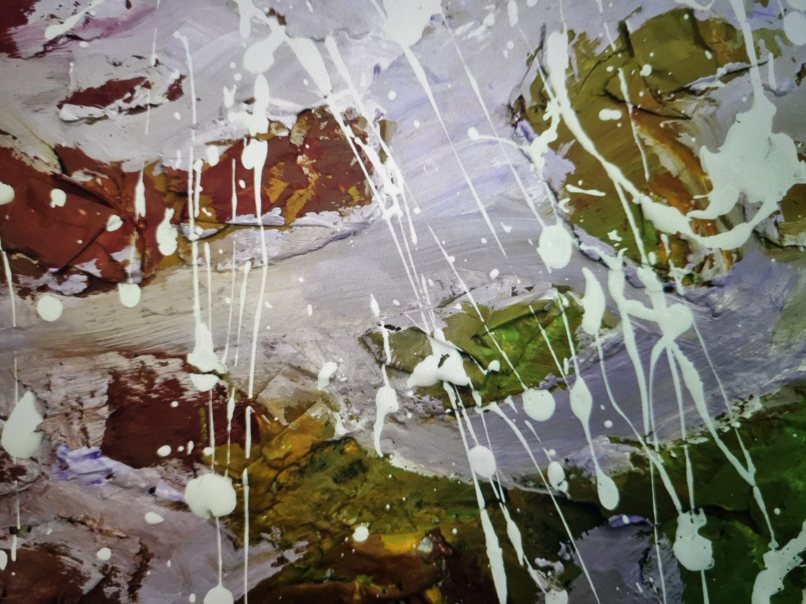
This series takes those landscape images, not as subjects to copy, but as starting points for abstract interpretation. It’s not realism but it’s not traditional Impressionism either, i’m not sure what i’d call it but its probably a post-something. Instead, I’m pulling out shapes, colours, and textures of what the place felt like. That means rough edges, unexpected colour combinations, and lots of layering and arcs over mixed media.
The Process
I started with scraps of cardboard as the base material. It’s accessible, quick to prep, and has a raw edge to it., especially when it’s cut roughly into oblong landscape/portrait format. I let some of the jaggedness stay on purpose. There’s something satisfying about not having to over-polish the surface before you even begin, and its the perfect excuse after you’ve ripped open an amazon parcel…
Once cut, I sketch loosely with pencil. I’m not aiming to draw every detail of the mountain or hillside (save that for when we talk about post impressionism or realism), but more the overall form where the slope turns, the way one ridge overlaps another, or how a valley pulls your eye downward. I focus on gesture and direction and generally have the pencil very loosely in my hand (think holding a singular chopstick and letting it rest over the gap between your index and thumb).
Then I bring in texture. Tissue paper and scrunched-up paper are glued to the shapes, overlapping the sketch lines and bleeding past the borders. It’s messy on purpose (oh yeah don’t forget to put another layer of cardboard underneath…). These layers start to mimic the rough terrain or the feel of rock and earth. And they give the paint something to jump off of later.
The pallette knife also does some of the leg work for you and you can thrust directionally, again quite loosely in hand. Experiment with this on a spare piece of card, and do the same when mixing colours before you commit.
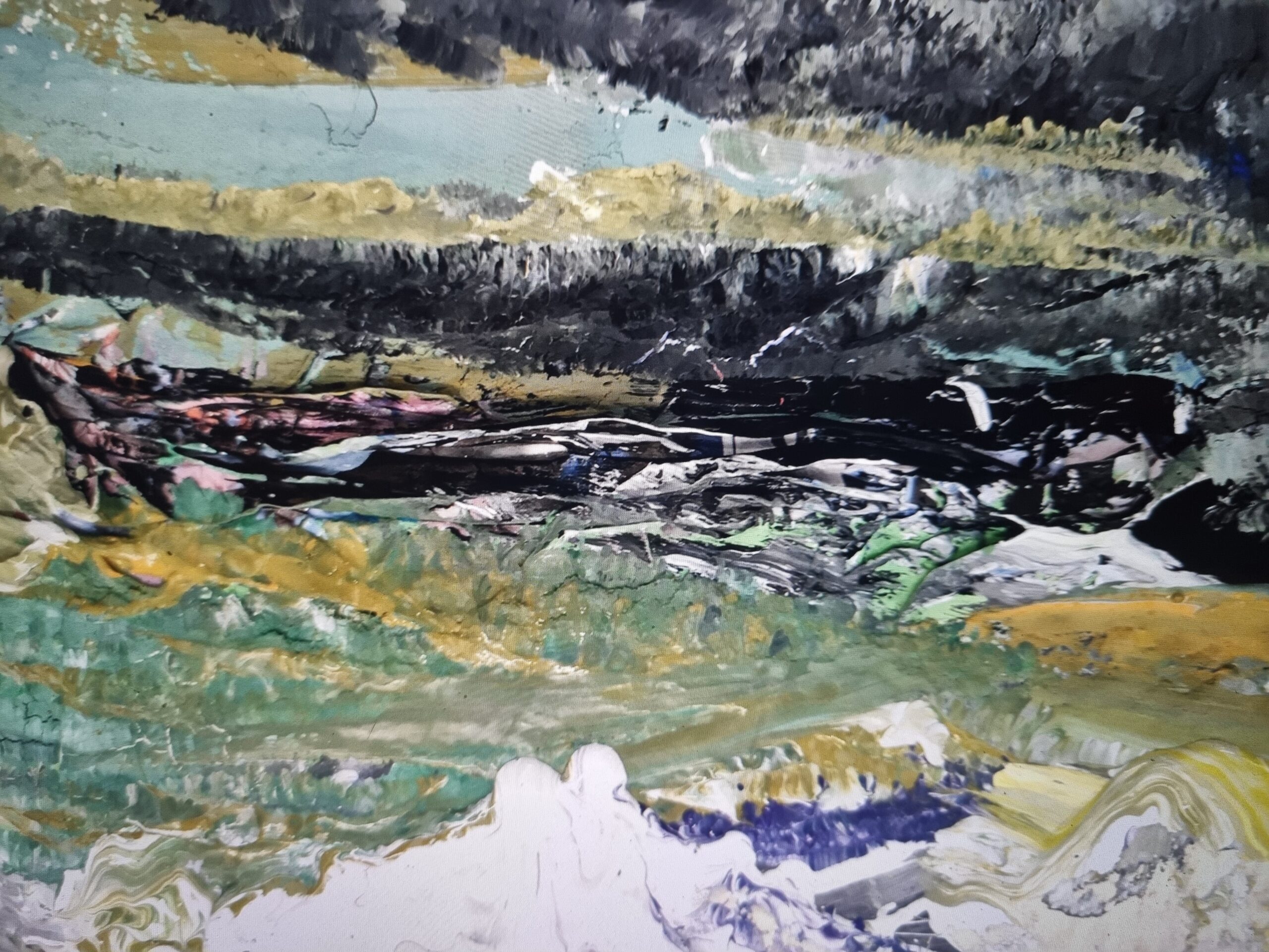
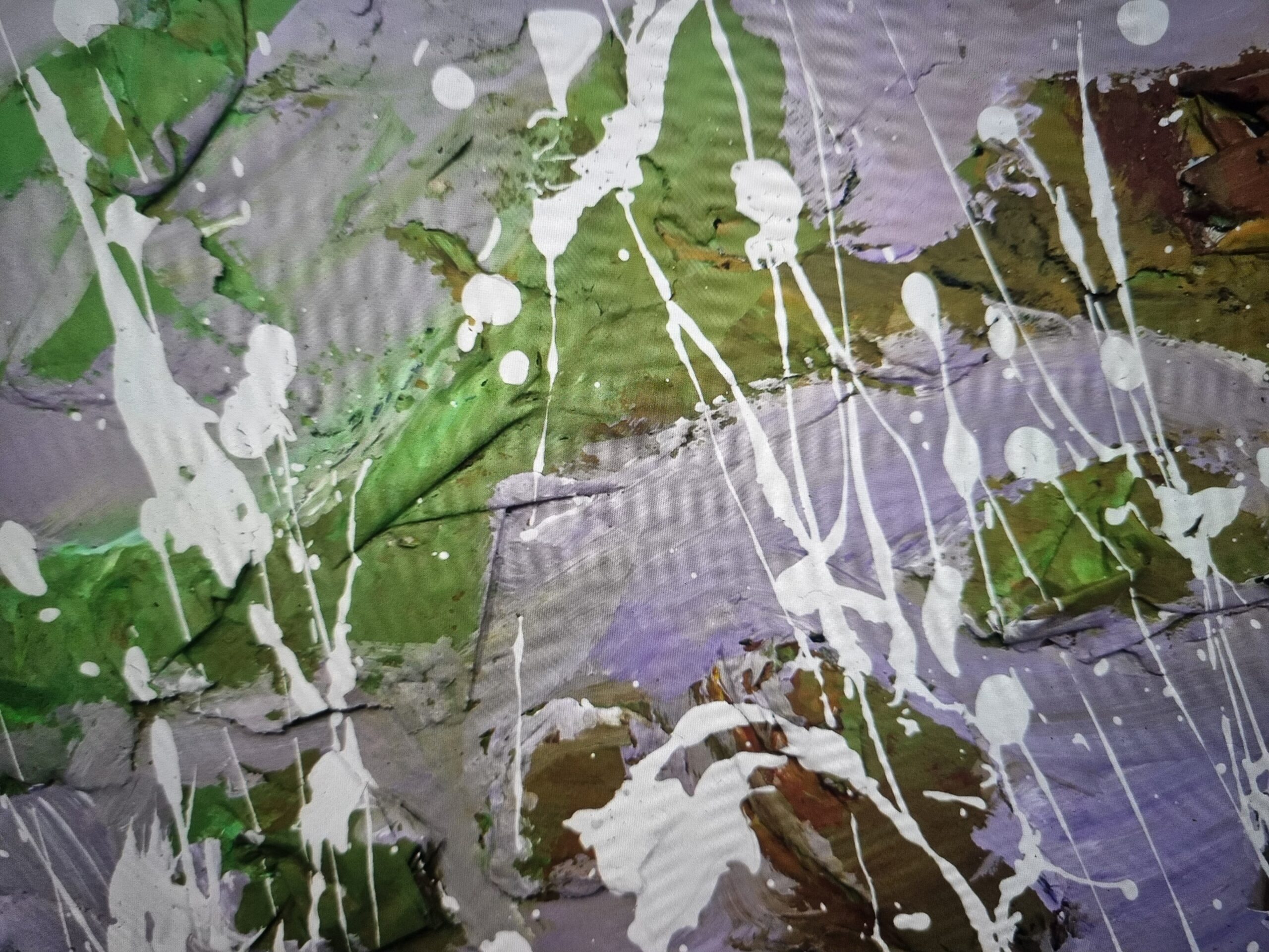
Once the glue’s dried, I move in with the palette knife. Thick, generous amounts of acrylic paint go on, and I let the marks build up with intention. I’ve prepped a colour palette using thumbnail experiments in my sketchbook—pulling shades from the natural world. Sometimes the palette comes from a particular walk I remember. Other times, I play around until something clicks. In this series, I leaned into earthy greens, moody greys, rusty ochres, and occasional punches of ultramarine or bright white to cut through the moodiness.
The way the paint leaps over the tissue creates mountainous edges, somehow you’re emulating landscape in relief. That 3D texture becomes part of the image, not just something underneath it. There’s a tension between control and letting things happen, and quite satisfying to see that theres another dimension added for natural light and shadow.
Tip: You can light this from an angle with your phone or a head torch then photograph it. This works really well with Contrasting typography for graphic design posters. You can also use this for repeat patterns for fashion and textiles, or sublimations on garments.
 If you’re a younger artist or just getting started, this is a great place to explore and it’s relatively cheap to pick up acrylics to use. It might feel wasteful at first, and it can be, but start small and work your way up to bigger works.
Try a few studies or rough versions on cheap card or packaging. Let them dry, paint over them, throw some contrasting acrylic over it, change direction… You’ll learn so much in the process and you’ll feel some freedom doing it. Then figure out how that’s going to translate into an output (e.g. is it going to be a standalone piece, will you add text, will you mask areas and use as a fill, does it repeat?)
A Note on Sketchbooks
I can’t say this enough, sketchbooks matter.
When you’re looking at form you can experiment with A LOT of compositions. Make sure you’re choosing some forms that justify using that much acryylic. Make it interesting, worthwhile, and have an end result in mind but be willing to adapt it.
They’re where you build ideas quietly, without pressure. I’ve been using mine to test colour palettes, experiment with mark-making, and play with small-scale compositions before moving to the main pieces.Sometimes instead of a pallette knife ill use other strips of card to scrape and scratch, slop ink on. Sometimes ill use my fingers, or hatched plastic or other textured materials to If you haven’t already, check out my earlier posts on using sketchbooks effectively. It’s one of the best habits I’ve built over the years.
You don’t need everything figured out. Just start with one idea and let it lead you somewhere. Let the edges be jagged, let the paper tear, let the colour run. That’s where the character lives. And remember, the time spent experimenting is never wasted, it’s where the real work happens and you learn the most.
#AbstractLandscapeArt #ImpressionistInspired #MixedMediaArt #CardboardArt #ScottishHighlandsArt #UKArtistBlog #YoungArtistsUK #TravelInspiredArt #SketchbookPractice #AcrylicPaintingUK #WhereToSellArt #CreativeExperimentation #LandscapeAbstraction

No responses yet